Intro to UI Controls
User interface (UI) controls are the building blocks of any software interface. Using them intelligently can guide users through your product as you intend, by making it feel familiar and learnable even if they have never used it before.
Becoming familiar with them as a user interface designer is essential for a good user experience. Many new designers get stuck trying to decide whether to use a checkbox or a radio button on a form, for example, or how many navigation tabs on a screen is too many. That's what this section is all about.
Fortunately, best practices and guidelines for user interface controls are well established, through years (often decades) of research and practice.
In the next few articles we'll introduce the most common user interface control types, describe when and how to use them, and show examples and variations that will make you feel comfortable choosing and using them in your own designs.
UI controls are like the ingredients in a recipe. Learn their unique flavors and characteristics and you can improvise, customize, and substitute to meet your needs (or those of your specific users). Get to know them well enough and you can start creating your own recipes (design patterns) from scratch.
Some of the most common controls are listed below. Roughly speaking, they can be grouped as follows:
- those that accept input, such as the controls you'd find on a form
- navigation controls, which allow users to move around in your app or site
- display controls, which communicate information to the user.
To learn about how and when to use all the control types included with Balsamiq, see our UI Control Guidelines.
Common input controls
Input controls allow users to enter information via keyboard or mouse/touch.
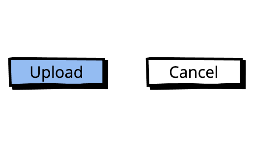
Buttons
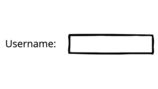
Text Input
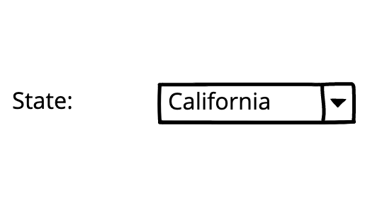
Dropdown Menus / Combo Boxes
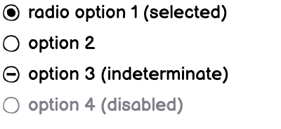
Radio Buttons
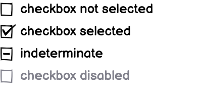
Checkboxes
Common navigation controls
Navigation controls allow users to move around within or across a site or application.
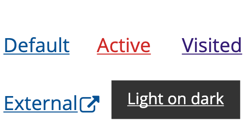
Links
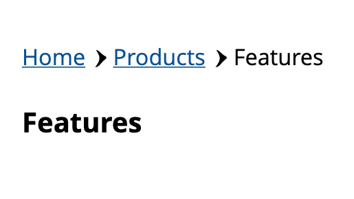
Breadcrumbs
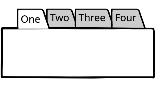
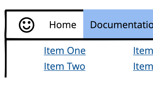
Tabs
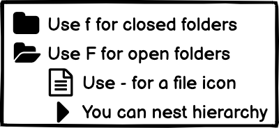
Tree Panes
Menus
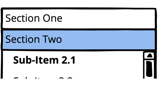
Accordions
Common display controls
Display controls present information on the screen to the user.
Text
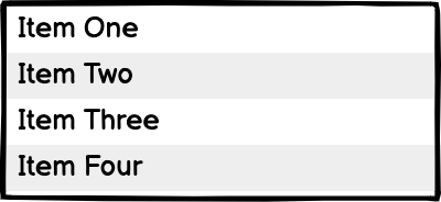
Lists
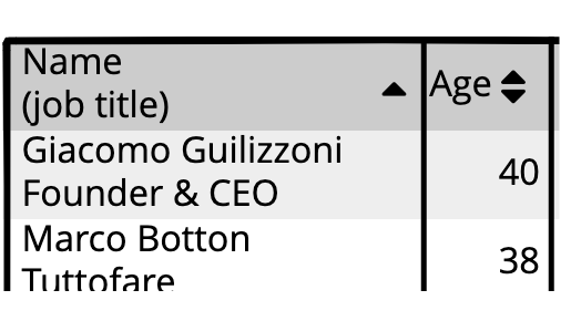
Data Grids
Tooltips
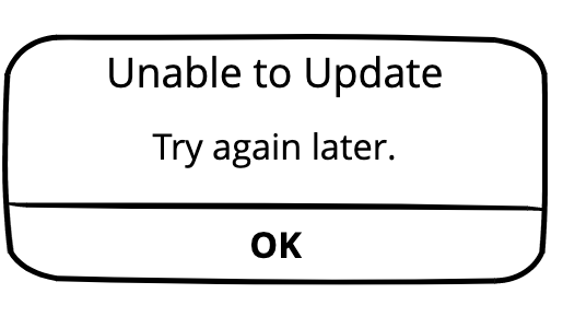
Alerts
Icons
 By Leon Barnard
Got questions or feedback? Email support@balsamiq.com.