Landing pages have one job: convert.
But, when it comes to building landing pages, there’s always the age-old debate between starting with copy or design.
The real answer is neither. Like a resilient skyscraper, great landing pages start with structure.
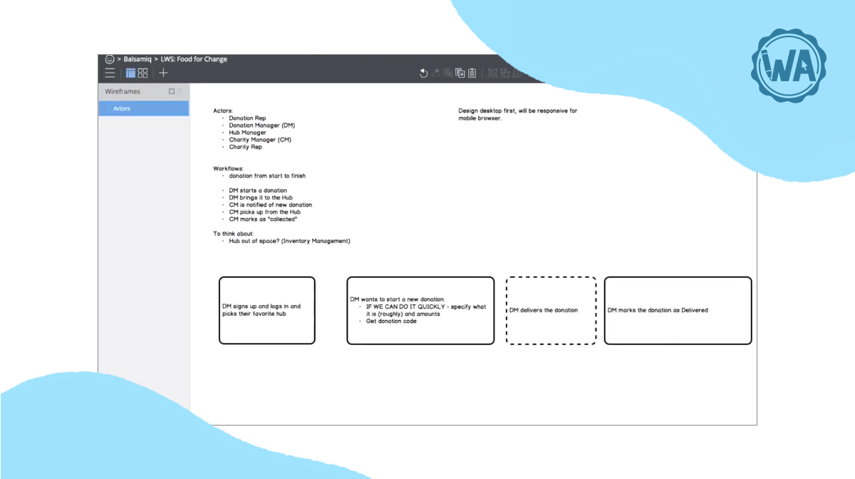
You start with what the goal of this page is. Then, you figure out what you want to say, how you want to say it, and how people will move through the page. After this, you add the polish. Wireframing is the step that helps you get there. It helps you see how your message and layout work together, letting you refine the user flow long before you open a design tool.
At Balsamiq, we believe in the power of good product thinking—and that extends to your website. Good product thinking starts with a simple wireframe.
So let's walk through how our team uses Balsamiq to build high-converting landing page wireframes. The best part? You don't need to be a seasoned marketer or design expert to pick this up quickly.
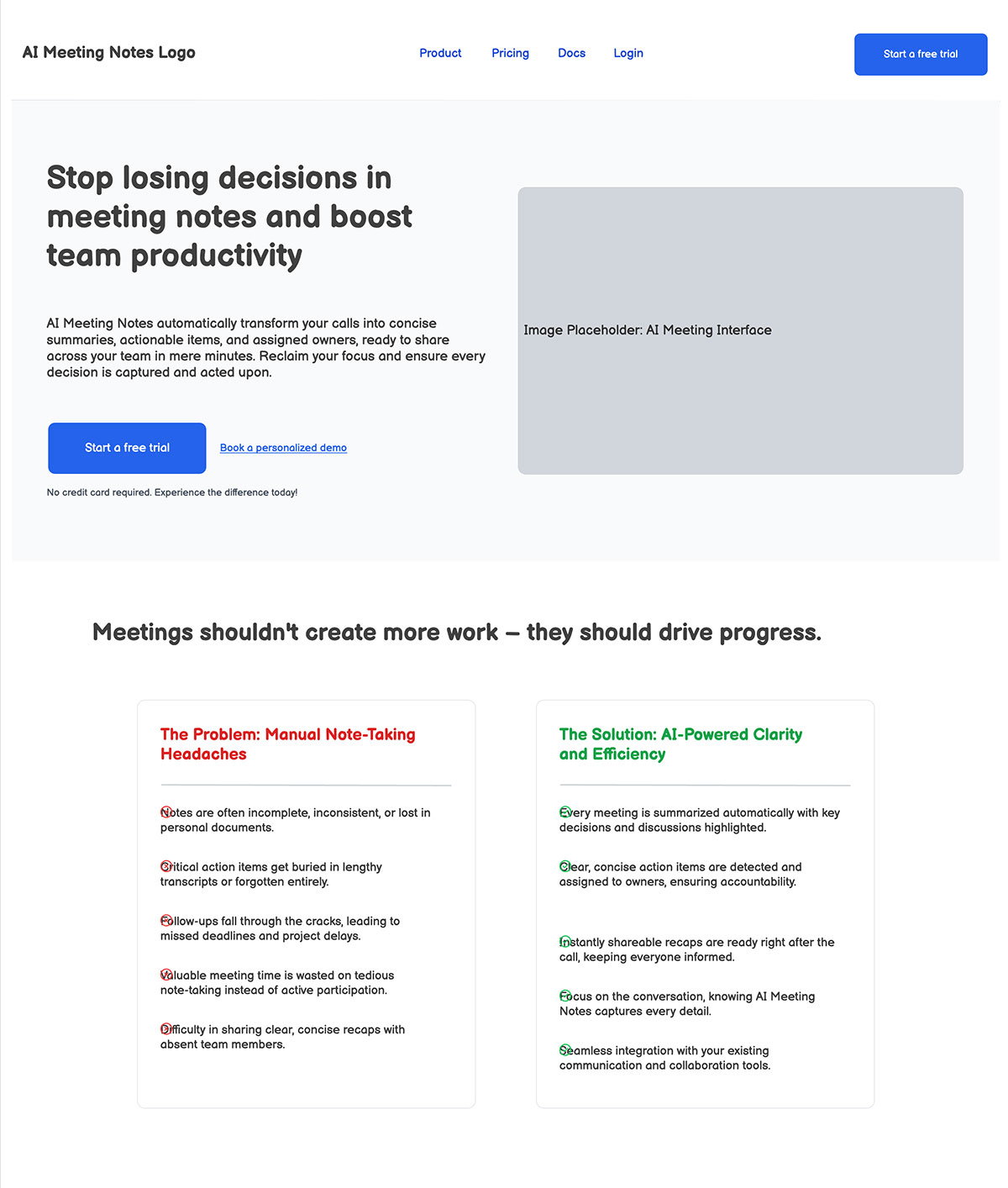
What makes a great landing page?
Great landing pages get users to take one specific action, like:
- Sign up for a free trial
- Register for a webinar
- Subscribe to your newsletter
In order to get your user to take the intended action, it’s best to follow a few basic UI principles to keep things simple.
Here’s how you can keep your user focused, on track, and convert them:
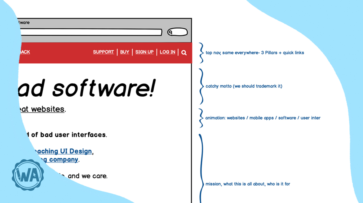
- A clear hierarchy: Make the most important things the biggest. Your headline, subhead, and call-to-action button should stand out immediately. This is also where you can determine if you want to layout the page in an F-pattern or Z-pattern.
- One primary action: Don’t overwhelm people with choices. Pick one goal (register, sign up, join, etc.) and lead everything toward it.
- Supportive content: Include space for social proof, like customer testimonials or partner logos, to build trust. This helps visitors feel more confident in your product.
- Feature highlights: Use short sections to explain the why. Focus on the benefits that matter most to your audience.
- Use plenty of whitespace: Don’t be afraid of empty space. It helps guide the eye and prevents the page from feeling cluttered or confusing.
- A responsive layout: Think about how the page will look on a phone vs. a desktop. A good wireframe should consider how elements stack and shift on different screen sizes.
"A great landing page makes the human experiencing it feel seen and understood. The message is tightly aligned to a specific persona, it speaks to the outcome they care about—not just a list of features. Ultimately, it must remove friction by providing a clear solution and next action. If someone lands and knows ‘this is for me’ and ‘here’s my next step,’ the page has done its job."
 John Thomas Lang,Head of Marketing @ Coinflow

How to create a landing page wireframe in 6 steps
Wireframing doesn’t have to be complicated. Like the user you’re trying to convert, you’ll also benefit from keeping things simple and focused. Check out these six super simple steps to build a quality landing page wireframe that’ll set your users up for success.
1. Frame the board
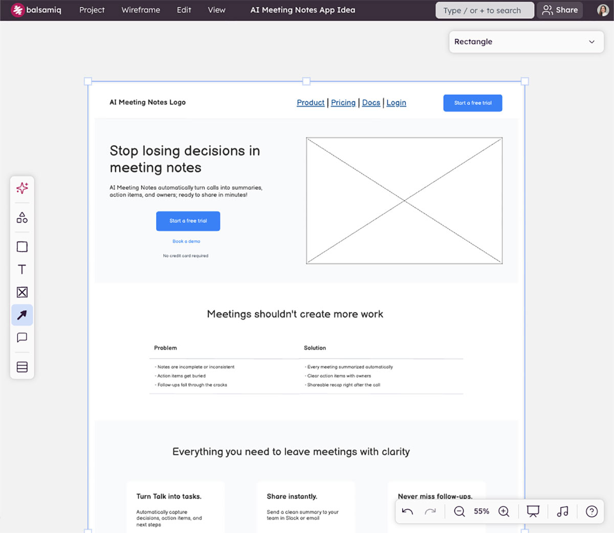
First, you need to decide what screen you’re designing for. For most landing pages, starting with a Desktop size is best. Once you’ve picked your board, give your wireframe a clear name so you (and your team) can stay organized.
Starting with one screen size doesn’t mean that you’re ignoring the rest. Pick a frame that reflects your users’ behavior. You can easily access this data through tools like Google Analytics.
2. Place the core elements
Focus on the area above the fold because this is what people see before they start scrolling. Add a large headline, a subheadline, and a clear button for your primary action. You can also use a simple placeholder box for your main product image.
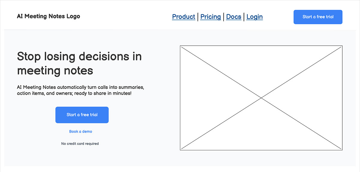
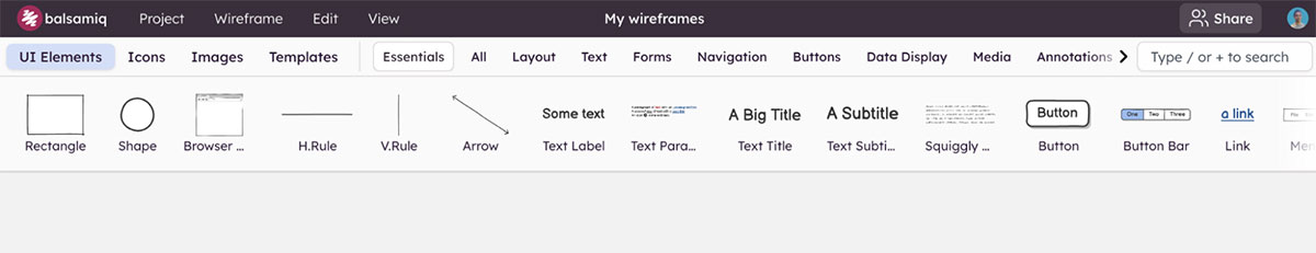
With Balsamiq, you’ll be able to quickly build your landing page wireframe by using pre-built UI elements, icons, images, and templates directly from our library. Easily add in placeholders for core landing page elements like:
- Buttons
- Links
- Headings, subheadings, and supporting copy
- Image or video placeholders
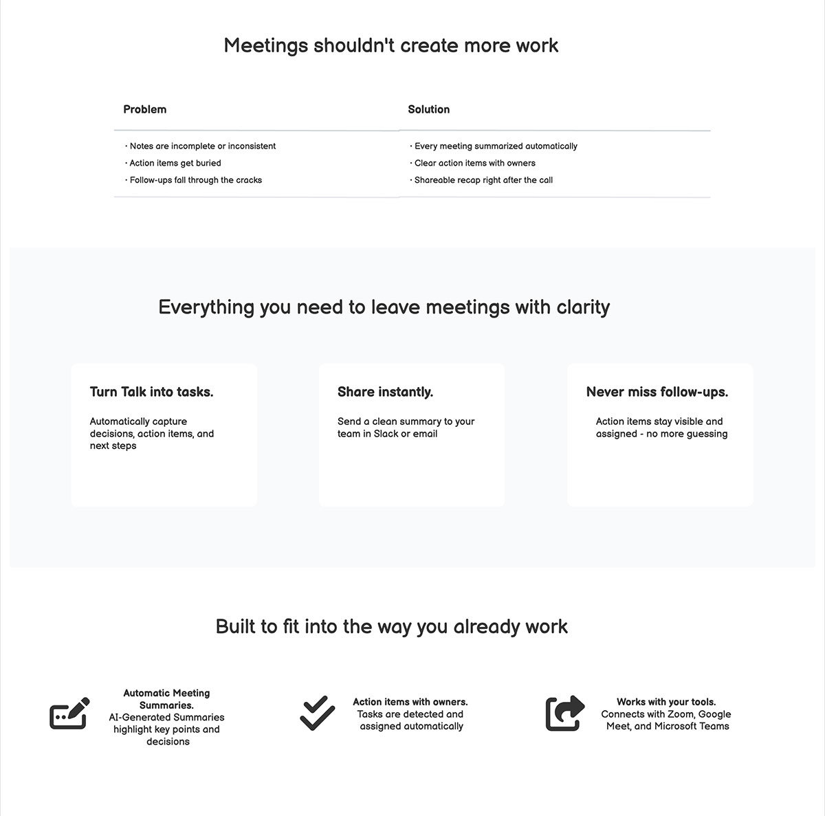
3. Add key sections
Once you’ve framed the board and placed the core elements, scroll down and build the rest of the story. Use blocks to represent sections for the problem you’re solving, the benefits of your product, and a few specific features. If you aren't sure which components to use, our UI element guidelines can help you pick the right tools for the job.
While every landing page is different, some common sections to include are:
- Above-the-fold (ATF): Also called your hero section, this is what visitors see before scrolling. It should include a clear headline, supporting copy, a prominent CTA, and often a visual element like a hero image, product screenshot, animation, or video.
- Benefits section: Here’s where you highlight the key benefits of your offering—not just features, but the actual value users will get.
- Social proof: Whether it's logos, testimonials, case studies, ratings, or awards, this section builds credibility and trust.
- Final CTA section: Your last chance to convert, often mirroring the ATF with a clear headline, pitch, and CTA.
4. Refine and iterate
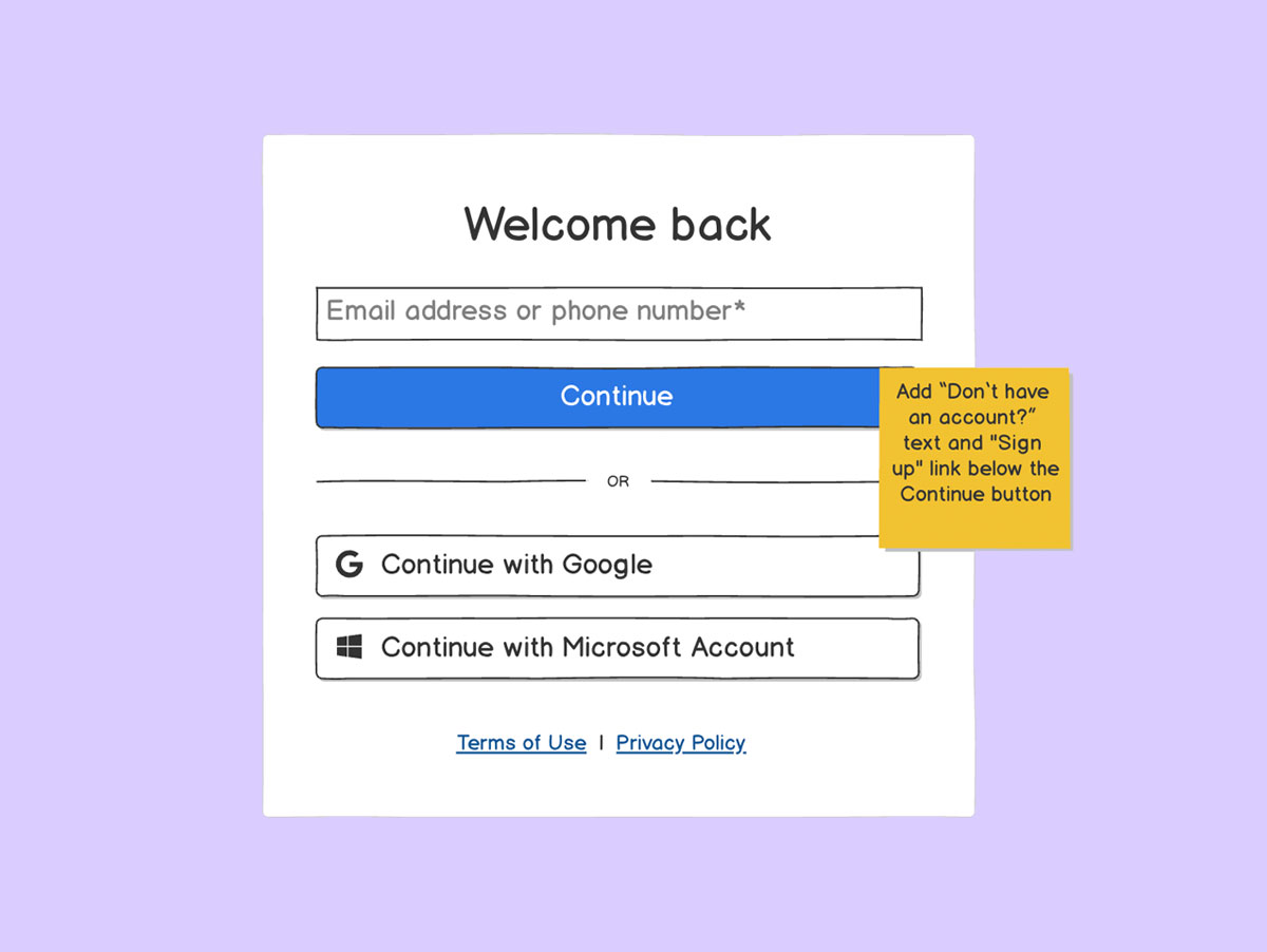
After the big pieces are in place, take a moment to tidy things up. Use the alignment tools to make sure everything is straight. If a section feels too busy, try to simplify the text or increase the space around the elements.
By trimming the text and giving your elements more room to breathe, the page is much easier to scan. That’ll make sure your visitor’s attention stays on the main message rather than getting lost in a wall of words.
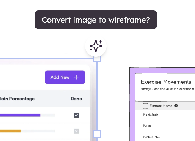
5. Use Balsamiq AI (optional)
If you’re feeling stuck or just want to move faster, try using our built-in wireframing AI tool. It can generate a rough first draft of a landing page for you. It’s a great way to get over “blank page syndrome” and gives you something to react to and edit.
6. Tweak and present
Do one last pass to make sure the flow makes sense. When you’re ready, you can export your wireframe as a PDF or an image. Sharing a rough sketch is a great way to get honest feedback from your team before anyone starts the real design or coding work.
Why wireframing first matters
It’s tempting to dive straight into colors, fonts, and high-res images. But skipping the wireframe usually just creates more work later. Instead, starting with a simple sketch is the smarter move for several reasons:
- Avoid miscommunication: Wireframes keep the conversation focused on how the page actually works.
- Reduce rework: It takes seconds to move a box in a wireframe and hours once it’s coded.
- Speed up development: A good wireframe helps your team balance speed with clarity.
- Get everyone on the same page faster: Wireframes communicate product thinking clearly, regardless of job title.
Ready to sketch your first landing page?
Landing pages work best when the thinking comes before the styling. Wireframing gives you the space to explore ideas, test your message, and build a layout that actually converts—without getting lost in pixel-perfect details.
Balsamiq makes this process simple. We keep the focus on structure, clarity, and communication. And once your wireframe is solid, you can hand it off to design or development and feel really good about it.
If you’re starting your first landing page wireframe, try Balsamiq free for 14 days and sketch the hero section. That single step alone will get you going in the right direction.