Wireframes
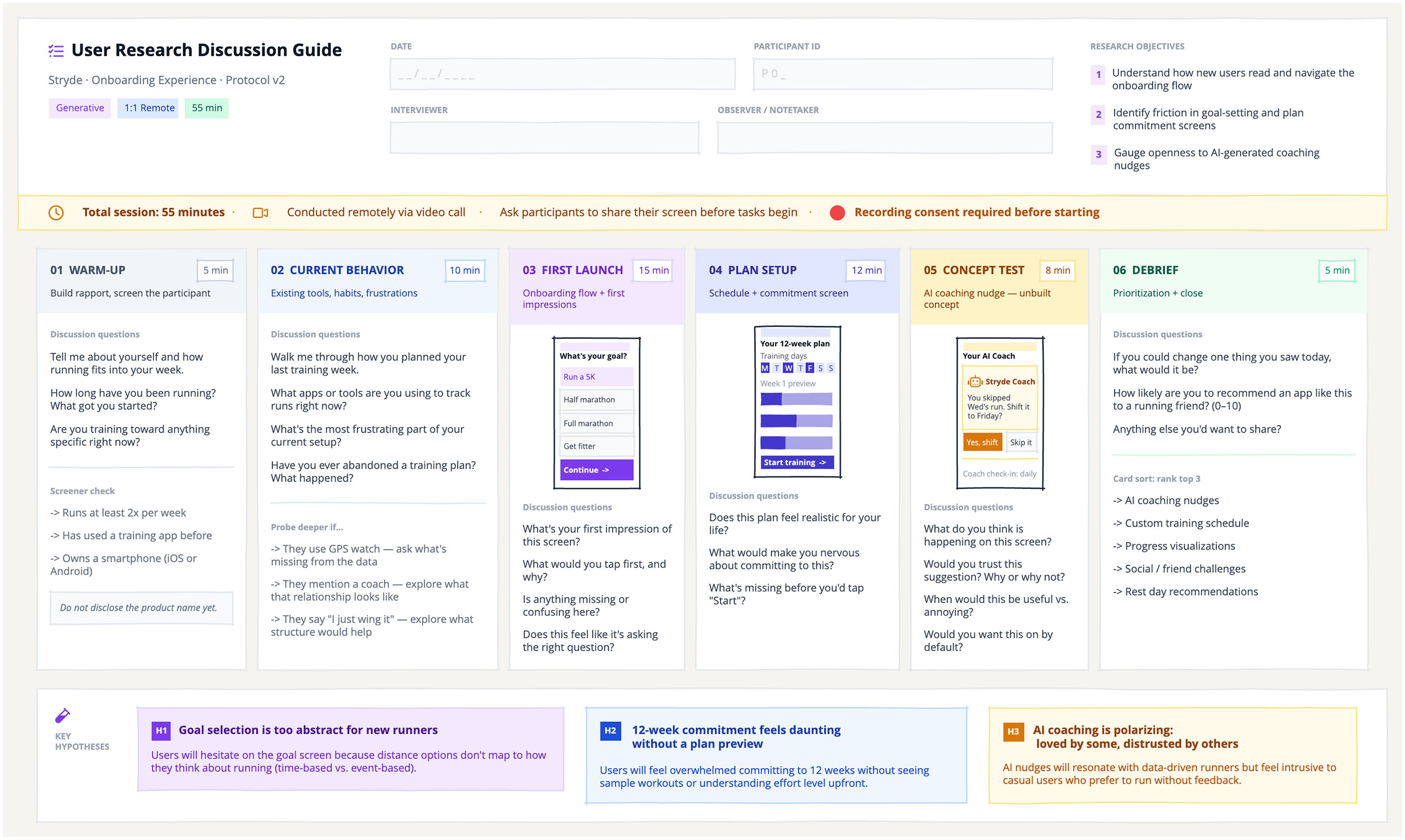
A single detailed wireframe breaks the interview into six timed stages: warm-up, current behaviour, first launch, plan setup, concept test, and debrief. Each section includes the core questions and a time allocation, so the researcher has everything they need in one view during the session.
The fast way
Recreate this in Balsamiq AI
Paste this prompt into Balsamiq AI to generate a similar flow, then edit any line to make it yours.
Swap the brand name, change the colors, add or remove steps and fields.
Prompt for Balsamiq AI
Prompt generates AI designs. Results may vary.
Build a single wireframe board that works as a user research discussion guide — a whiteboard-style interview protocol document, not a product UI. The board demonstrates Balsamiq as a planning and facilitation tool: you're mapping out the interview flow and embedding lo-fidelity screen references alongside the discussion questions, so a researcher can run a session directly from this board.

Use 1440px board width. The background is #F5F4F0 — a warm off-white that reads like paper and sets this apart from any product wireframe. There is no sidebar, no nav, no top bar in the traditional sense. This is a document.

The board has four stacked sections from top to bottom:

Section 1 — Header

A white rectangle (#FFFFFF) with a solid #E5E7EB bottom border, full-width, with 32px horizontal padding and 22px vertical padding. It's a three-column row:

Left column (320px): The guide title and session tags.

An fa-list-check icon (16px, #7C3AED) beside the bold title "User Research Discussion Guide" (18px, #111827), in a row.
Below it, a subtitle line: the product name, study focus, and version number in #6B7280 (12px).
Below that, three small tag pills in a row: one purple (#F3E8FF / #7C3AED) for the research method (e.g. "Generative"), one blue (#DBEAFE / #1E40AF) for the format (e.g. "1:1 Remote"), one green (#D1FAE5 / #065F46) for total time (e.g. "55 min").

Center column (flexGrow): Session metadata — two rows of two fill-in fields each. Each field is a label (#9CA3AF, 9px, bold, all-caps) above a light gray input box (#F9FAFB background, #E5E7EB border, light placeholder text). The four fields are: DATE · PARTICIPANT ID · INTERVIEWER · OBSERVER / NOTETAKER.

Right column (280px): Research objectives. A small "RESEARCH OBJECTIVES" label (#9CA3AF, 9px, bold, all-caps) above three numbered items. Each item is a purple number badge (#F3E8FF background, #7C3AED text) beside a short objective sentence (#374151, 11px). The objectives should correspond to the product and study being described.

Section 2 — Timing Banner

A full-width amber banner (#FFFBEB background, #FDE68A border). 8px vertical padding, 32px horizontal. A horizontal row containing: an fa-clock icon (#D97706, 16px), total session time in bold (#92400E), separator dots, an fa-video icon, a note about the remote format, another separator, a plain note about screen sharing, another separator, a red fa-circle icon (16px), and a bold reminder about recording consent (#B45309).

Section 3 — Phase Cards (the main content)

A row of six equal-width phase cards with 20px padding on all sides and 12px gap between cards. Each card is a white rectangle (#FFFFFF, #E5E7EB border) with a column layout and no internal gap — the header and content areas are separate children that stack flush.

Each card has two parts:

Phase header — a colored rectangle with 14px horizontal / 12px vertical padding, column layout:

First row: the phase number + name in bold 12px on the left, and a small time badge (white background, matching border color, 10px text) on the right — using justifyContent: "space-between".
Below it: a one-line description in 10px using a lighter tint of the header color.

Content area — padded 14px all around, column layout with 12px gap, flexGrow: 1:

A "Discussion questions" label in 9px bold #9CA3AF.
3–5 interview questions in 11px #374151, as individual text nodes (not a list control).
A horizontal divider.
A secondary section (probes, a screener check, a note, or a card sort list), labeled in 9px bold #9CA3AF, with items in 11px #6B7280 prefixed with "->".
For the screen-task phases (phases 3, 4, and 5), include a phone wireframe reference between the header and the questions. The wireframe is a rectangle (90px wide, ~158px tall, #FFFFFF background, #1E293B solid border) with a column layout, containing a 5px status bar rectangle in the phase's accent color at the top, followed by a small title, basic option buttons or UI elements at 7px font size, and a colored CTA button at the bottom. These are low-fidelity references — simple enough to sketch but recognizable as the screen being discussed.

The six phases and their colors:

Warm-up (5 min) — #F1F5F9 header / #475569 text. No wireframe. Questions: rapport-building, background, running history, screener check. Include a note box (#F8FAFC background, #E2E8F0 border) reminding the interviewer not to disclose the product name yet.
Current Behavior (10 min) — #EFF6FF header / #1E40AF text. No wireframe. Questions: current training habits, tools used, frustrations, abandoned plans. Probes for: GPS watch users, people who mention a coach, people who say they "wing it."
First Launch — Onboarding (15 min) — #F3E8FF header / #6D28D9 text. Includes phone wireframe. The screen shows a "What's your goal?" screen with 4 option pills (one selected in purple, three in gray), and a purple "Continue" CTA at the bottom. Questions: first impression, what they'd tap first, anything confusing or missing.
Plan Setup (12 min) — #E0E7FF header / #3730A3 text. Includes phone wireframe. The screen shows a training plan setup with a day-selector (7 day chips, some filled in indigo, some light), three thin progress bars representing Week 1 workouts, and a "Start training" CTA in indigo. Questions: whether the plan feels realistic, what makes them nervous about committing, what's missing before they'd tap Start.
Concept Test — AI Coach (8 min) — #FEF3C7 header / #92400E text. Includes phone wireframe. The screen shows an AI coaching card (#FFFBEB background, #FDE68A border) with an fa-robot icon (#D97706), a short nudge message about a skipped run, and two action buttons (amber "Yes, shift" and gray "Skip it"). Questions: what they think is happening, whether they'd trust it, when it would be useful vs. annoying, whether they'd want it on by default.
Debrief (5 min) — #F0FDF4 header / #065F46 text. No wireframe. Questions: one thing they'd change, NPS-style recommendation likelihood, anything else to share. Include a "Card sort: rank top 3" section listing 5 features they'd prioritize.

Section 4 — Key Hypotheses Footer

A white rectangle (#FFFFFF, #E5E7EB top border), full-width, 32px horizontal padding, 20px vertical, row layout with 24px gap.

Left side (110px): An fa-vial icon (16px, #7C3AED) above a "KEY HYPOTHESES" label (#9CA3AF, 9px, bold).

Three hypothesis cards (each flexGrow: 1), each a colored rectangle with a 14px padding column layout:

H1 (purple: #F3E8FF / #DDD6FE border): a dark purple #7C3AED badge with "H1" in white + a bold hypothesis title + a body sentence describing the belief and the expected user behavior.
H2 (blue: #EFF6FF / #BFDBFE border): a #1D4ED8 badge with "H2" + title + body.
H3 (amber: #FFFBEB / #FDE68A border): a #D97706 badge with "H3" + title + body.

Each hypothesis follows the structure: "We believe [users will do X] because [Y]." The three hypotheses should directly correspond to the three research objectives listed in the header.

Constraints:

The product name and study focus are up to you — swap in any fictional app and research scenario. The guide structure works for any 0→1 product, onboarding study, or concept test.
Use only fictional product and company names (no real brands).
Icon sizes must snap to valid Balsamiq values: 16, 24, 32, 48, 64, 128.
Use layout.wrap: true (boolean) if you need wrapping flex rows — never the string "wrap".
Font sizes snap to the nearest of: 8, 9, 10, 11, 12, 13, 14, 15, 16, 17, 18, 20, 24, 28, 32, 40, 60, 72.
The phone wireframes inside the phase cards are intentionally tiny (7px text, simplified controls). This is a reference, not a polished mockup.
Try editing it: change #F5F4F0 for your brand color — then regenerate.
Open Balsamiq AI