Wireframes
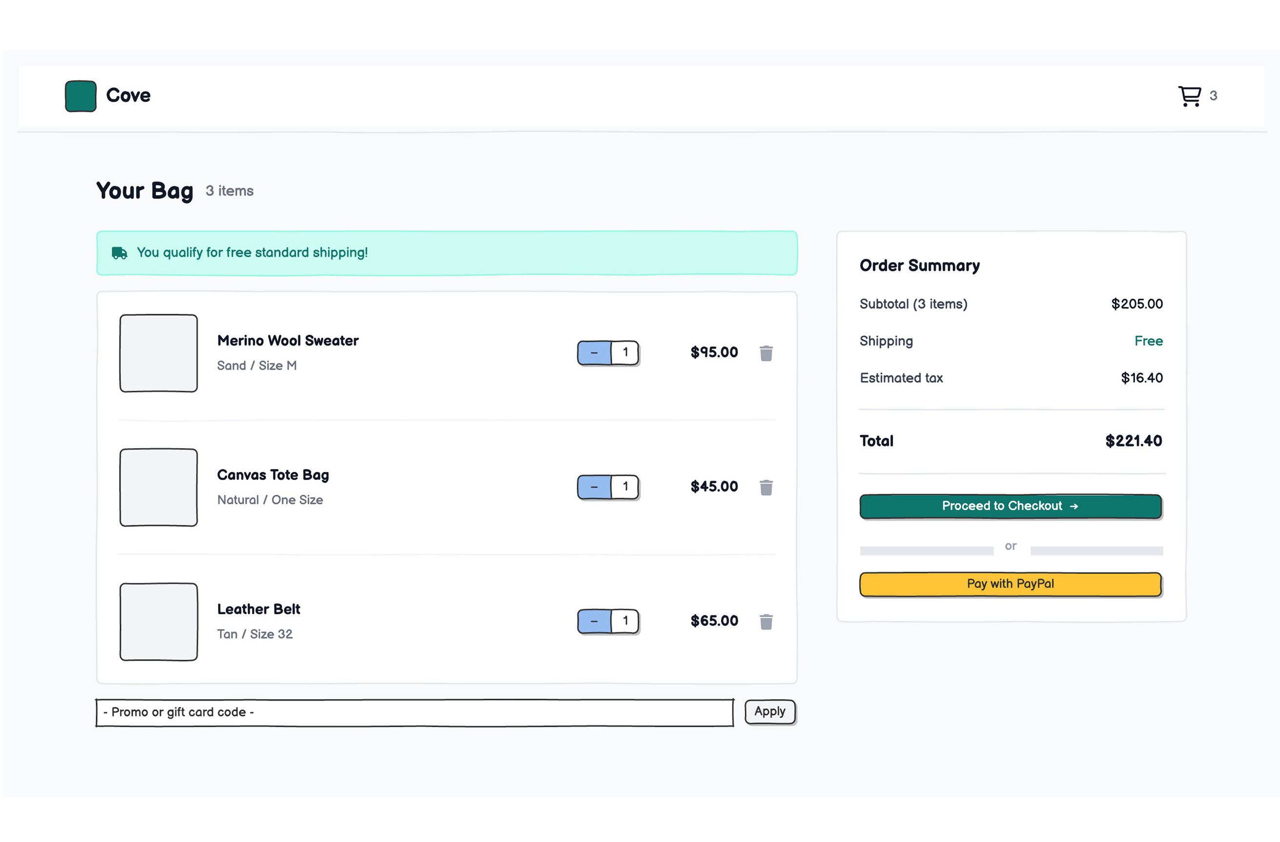
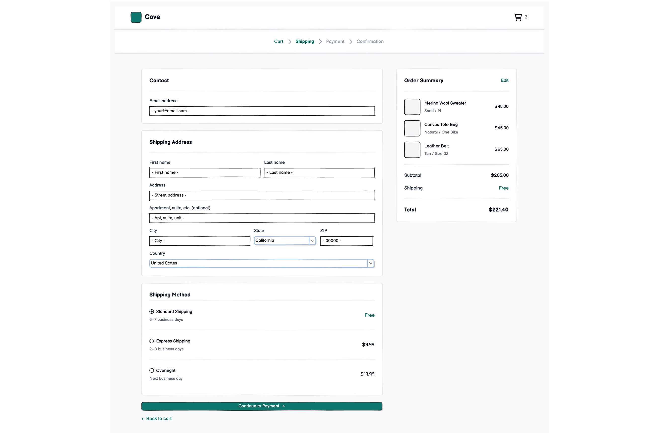
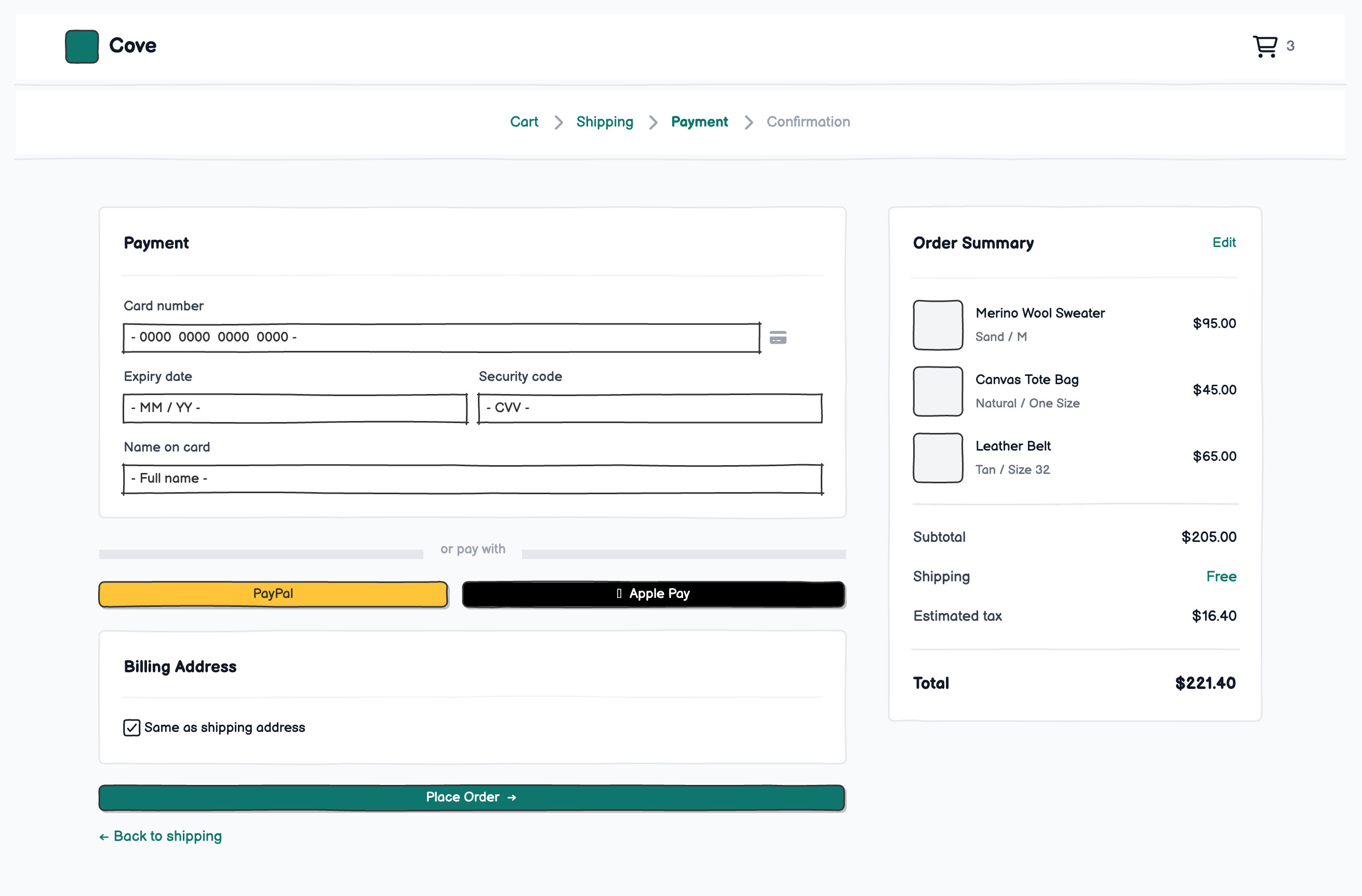
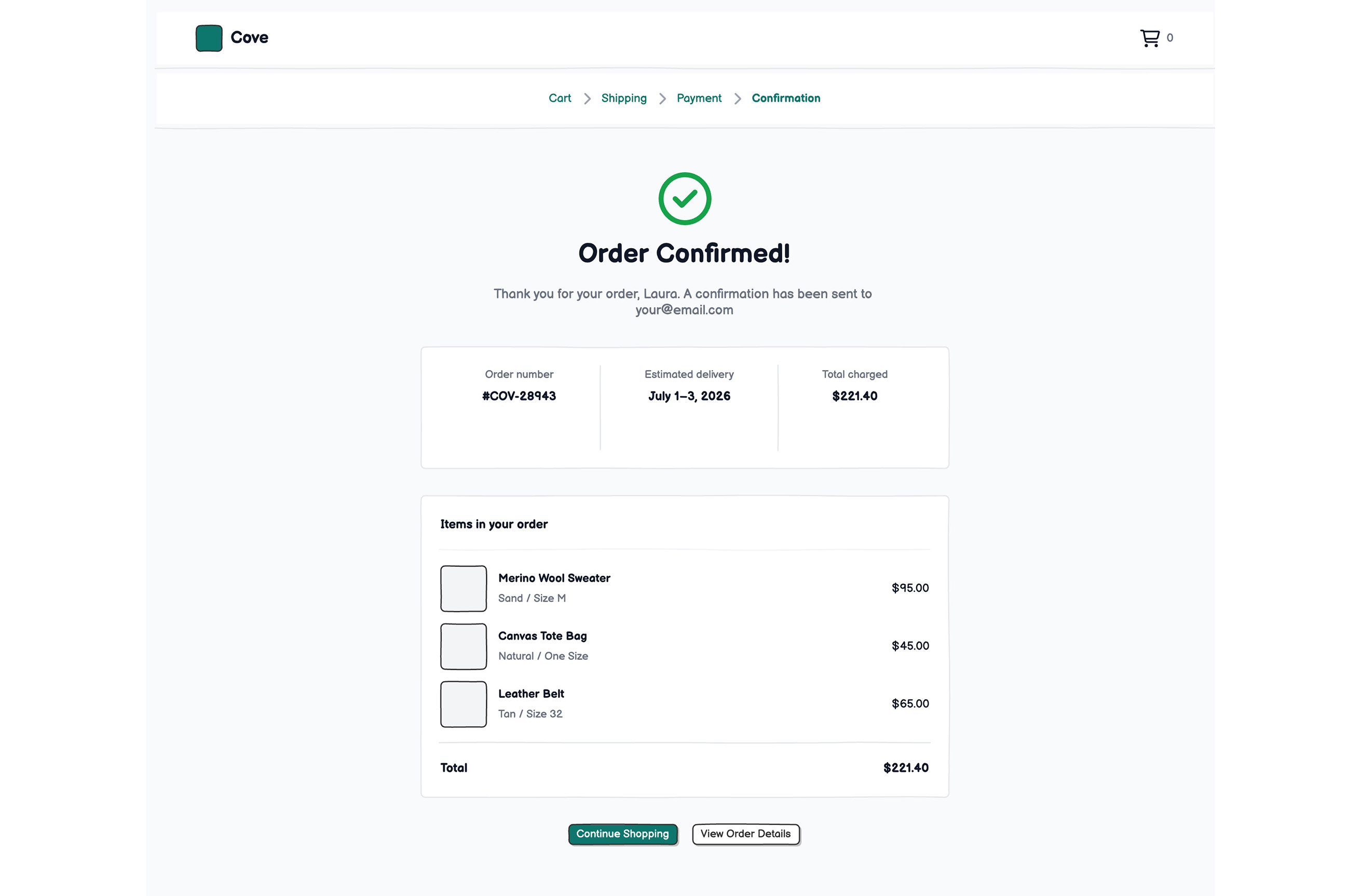
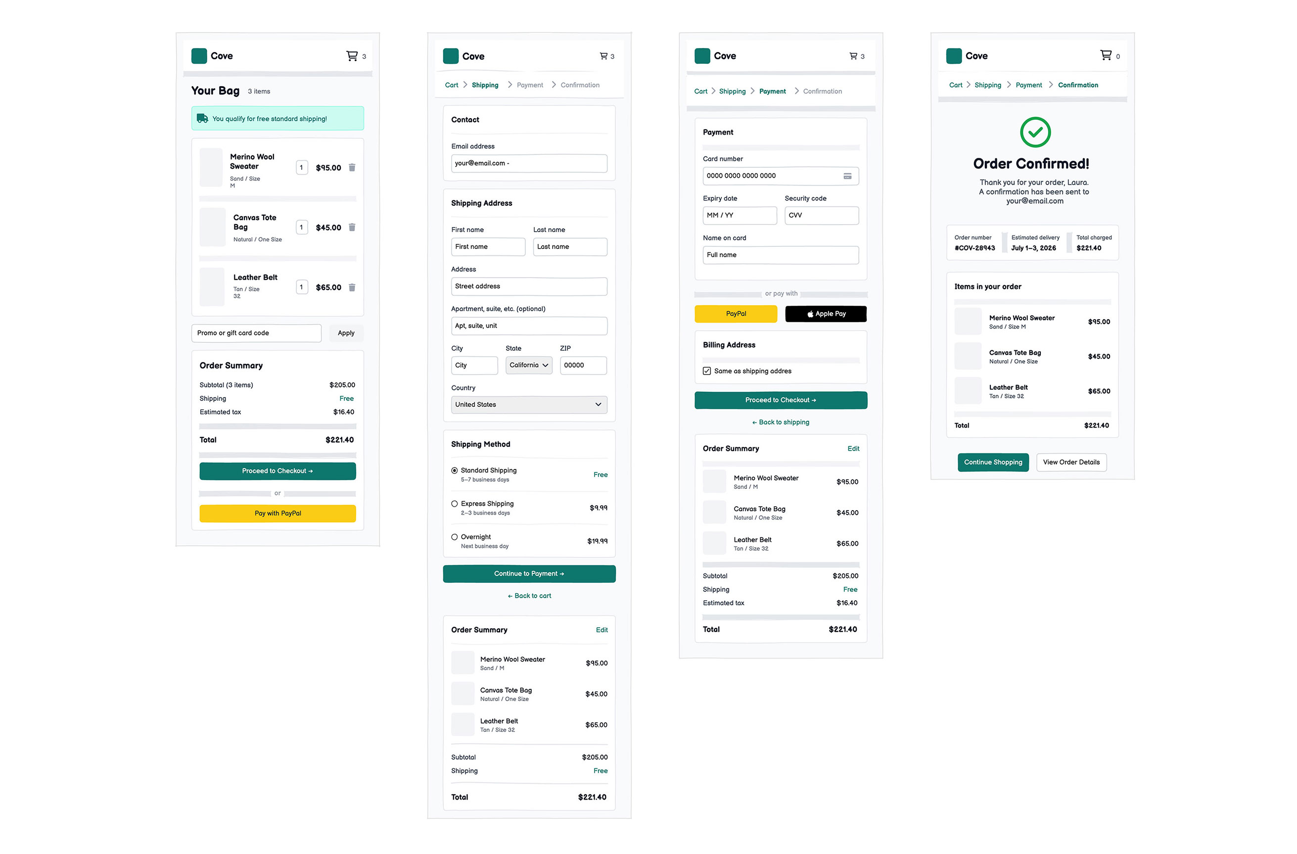
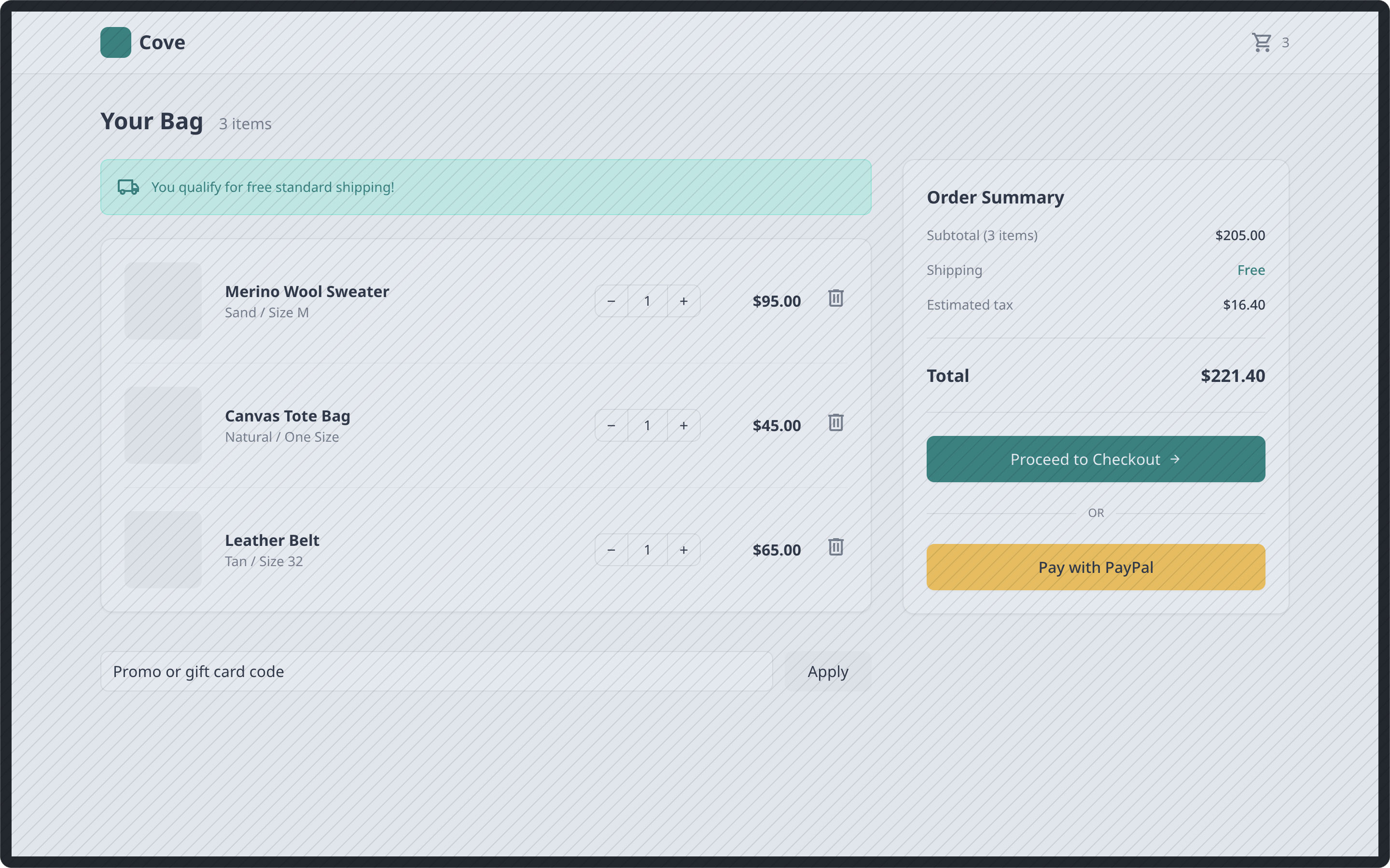
These screens break the checkout process down into four distinct steps: Cart review, Shipping details, Payment information, and Order confirmation.
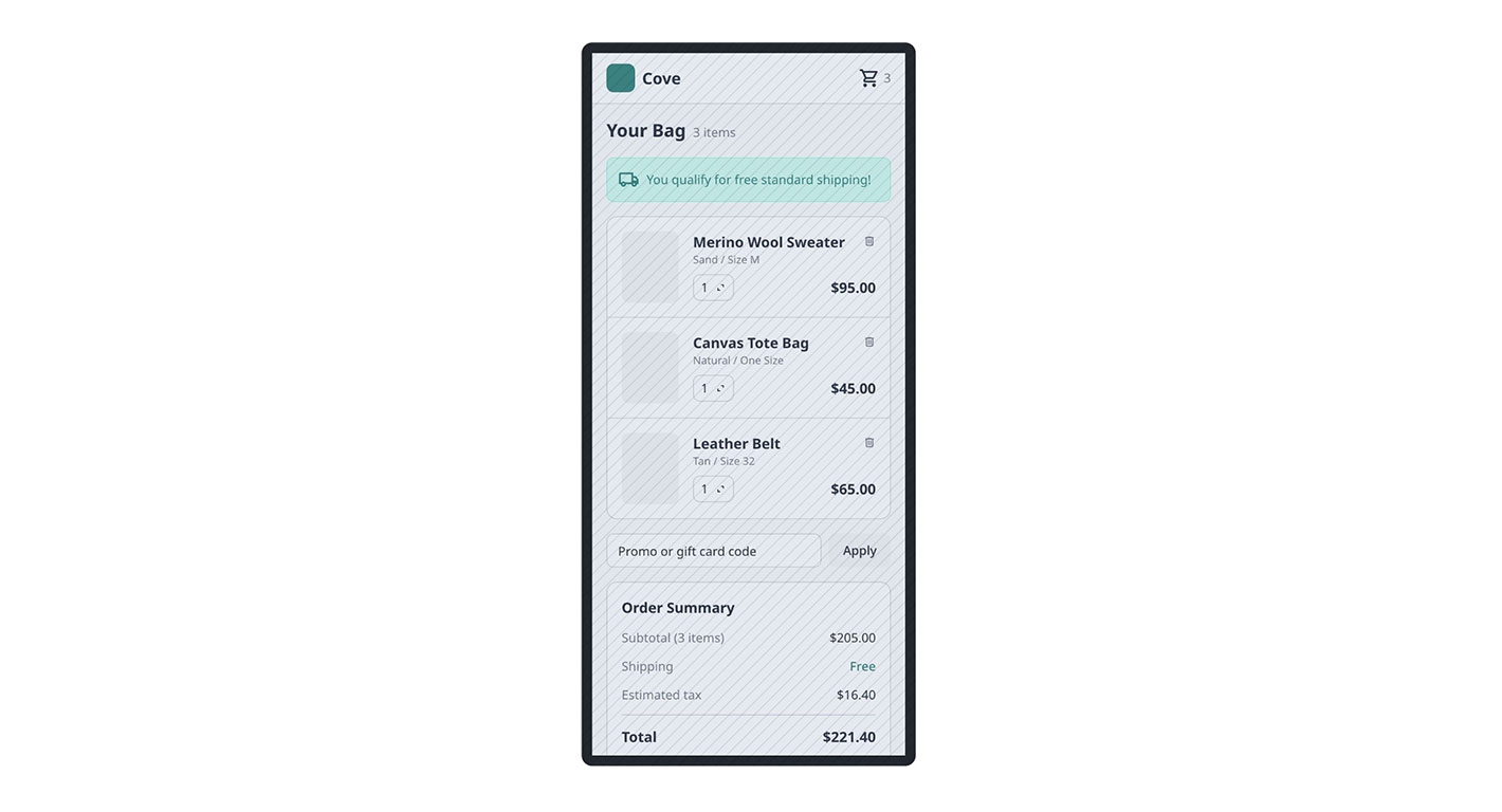
It also includes a mobile-optimized version of the flow, which is where the majority of e-commerce friction actually occurs.
The fast way
Recreate this in Balsamiq AI
Paste this prompt into Balsamiq AI to generate a similar flow, then edit any line to make it yours.
Swap the brand name, change the colors, add or remove steps and fields.
Prompt for Balsamiq AI
Prompt generates AI designs. Results may vary.
Create 4 desktop wireframe screens for "Cove", a checkout experience. These are UI screens, not a diagram or flowchart. Each screen is a full-width desktop page (1280px) with real UI elements: headers, forms, buttons, inputs, cards, and product images.

Shared header on every screen: Cove logo (teal rounded icon + wordmark) left-aligned, cart icon with item count right-aligned. Light gray page background. White cards with gray borders. Brand color is deep teal (#0F766E) for buttons, links, and highlights. Screens 2–4 show a breadcrumb stepper below the header: Cart › Shipping › Payment › Confirmation, with the current step in bold teal.

Screen 1 – Cart: Title "Your Bag (3 items)". Left column: a teal banner confirming free shipping, then a white card listing 3 products (each row has an image placeholder, product name and variant, a quantity stepper, price, and remove icon). Below: a promo code field and Apply button. Right column (fixed 360px): order summary card with subtotal $205.00, shipping Free, tax $16.40, total $221.40, a teal "Proceed to Checkout" button, and a PayPal button.

Screen 2 – Shipping: Stepper shows Shipping as active. Left column: a Contact card with an email input, a Shipping Address card with fields for first name, last name, address, city, state, ZIP, and country, and a Shipping Method card with three radio options (Standard / Free / 5–7 days selected, Express / $9.99, Overnight / $19.99). Teal "Continue to Payment" button below. Right column: condensed order summary with item thumbnails and total.

Screen 3 – Payment: Stepper shows Payment as active. Left column: a Payment card with card number, expiry, CVV, and name inputs, then an "or pay with" divider and PayPal + Apple Pay buttons side by side. A Billing Address card with a checked "Same as shipping address" checkbox. Teal "Place Order" button. Right column: same order summary.

Screen 4 – Confirmation: Stepper shows Confirmation as active. Centered layout: large green checkmark icon, "Order Confirmed!" heading, confirmation subtext. A row showing order number #COV-28943, estimated delivery July 1–3 2026, and total $221.40. A card listing the 3 ordered items with image placeholders and prices. Two buttons: "Continue Shopping" (teal filled) and "View Order Details" (teal outlined).
Try editing it: change "Cove" to your product name, or swap #0F766E for your brand color — then regenerate.
Open Balsamiq AI